Takafumi Saito*, Hiroko Nakamura Miyamura**, Mitsuyoshi Yamamoto, Hiroki Saito, Yuka Hoshiya, Takumi Kaseda are with Tokyo University of Agriculture and Technology
*email: txsaito@cc.tuat.ac.jp **e-mail: miyamura@cc.tuat.ac.jp
Abstract─A new pseudo coloring technique for large-scale one-dimensional datasets is proposed. For visualization of a large-scale dataset, user interaction is indispensable for selecting focus areas in the dataset. However, excessive switching of the visualized image makes it difficult for the user to recognize overview/detail and detail/detail relationships. The goal of this research is to develop techniques for visualizing details as precisely as possible in overview display. In this paper, visualization of a one-dimensional but very large dataset is considered. The proposed method is based on pseudo coloring, however, each scalar value corresponds to two discrete colors. By painting with two colors at each value, users can read out the value precisely. This method has many advantages: it requires little image space for visualization; both the overview and details of the dataset are visible in one image without distortion; and implementation is very simple. Several application examples, such as meteorological observation data and train convenience evaluation data, show the effectiveness of the method.
Index Terms─pseudo color, overview, detail, focus+context, data density
──────── ♦ ────────
INTRODUCTION
Information visualization techniques are becoming increasingly important for the analysis and exploration of large-scale data in various fields. For visualization of a large dataset, there is too much detailed information to be presented in a single image on a display screen, so the user must switch the image interactively to follow the exploration stage, such as overview, zoom, filter, or details [8].
However, image switching often leads the viewer to lose sight of the relationship between overview and details, or between details and details. Although image switching is necessary, excessive switching adversely affects the viewer's comprehension, so both overview and detail information should be presented in one image.
In this paper, a new technique for visualizing precise details in overview display is proposed. The target here is a one-dimensional but very large dataset. The proposed method is based on pseudo coloring, however, each scalar value corresponds to two discrete colors. By painting with two colors at each value, users can read out the value precisely. This method has many advantages: it requires little image space for visualization; both overview and details of the dataset are visible in one image without distortion, and implementation is very simple. The composition of this paper is as follows. In section 2, related
techniques are briefly reviewed. In section 3, the principle of the proposed method is introduced. In section 4, the proposed method is applied to various kinds of data: meteorological observation data, convenience analysis of train schedules, intermediate results of numerical computation, and visualization of the value at each point on curves. In section 5, some tips for effective usage of the method are summarized.
RELATED TECHNIQUES
This section introduces the existing techniques for displaying both overview and details, and discusses the conventional pseudo coloring technique.
Unified Display of Overview and Details
One common approach for displaying both overview and details is to apply focus+context techniques; both the global structure and detail information are displayed in one image with geometrical distortion. Many techniques such as fish eye view [3] and perspective wall [6] have been proposed. However, in most of the images by focus+context techniques, the topology of the global structure is maintained but the distance information is lost, which sometimes makes it hard to recognize the relationship between detail positions.
Another possible approach is to draw each detail element as precisely as possible in an overview display. This may appear to be established by reduced display of detail values in some conventional techniques. However, precise visualization of details within an overview image has not been examined enough. For example, pixel-oriented techniques [4] are effective to show the global features of multivariate data, but it is hard to read out each detail value. Table lenses [7] provide a reduced bar chart of detail data in each cell, but cannot show precise data without focusing on the cell.
For effective visual display, Tufte [9] stated that "data density" of a graphic is one of the important factors, where
In this sense, images by pixel-oriented techniques and table lenses have very large data density. Our goal requires both comprehensibility of overview structure and readability of precise detail values, in addition to large data density.
Pseudo Coloring
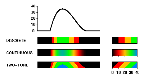
Pseudo coloring is one of the common techniques to visualize scalar data. Although it is usually used for two-dimensional domains (2D plane or a surface in 3-D space), it is also applicable to one dimensional data. Here, we suppose the situation of visualizing a one-dimensional function as a narrow rectangular area with pseudo coloring. In conventional pseudo coloring, there are two basic waysof using color: continuous coloring and discrete coloring (Figure 1).
Discrete coloring is to divide the range of the function into several sequential intervals, and to allocate a color to each interval. If the range is divided into m intervals with m - 1 threshold values, m discrete colors are used. With discrete coloring, it is easy to recognize the absolute value interval at each point, but is impossible to read the precise value or to see the change of value within each interval.
Continuous coloring is to allocate continuously changing colors to the range of the function. With continuous coloring, increases and decreases of the value are visualized as color graduations. However, it is difficult to read out the absolute value at each point, because the viewers tend to perceive the sequence of colors as a set of discrete ones placed in order and often misread the category boundaries [11].
As for pseudo color sequences, many perceptual issues have been studied [11]. For example, spectrum-approximation sequences have an advantage for reading values more accurately, and disadvantage for perceiving the shape of features such as ridges and valleys [10]. However, even if perceptually good color sequences are used, precise reading of detail values is difficult in conventional pseudo coloring.
ONE-DIMENSIONAL VISUALIZATION BY TWO-TONE PSEUDO COLORING
In this section, the concept and features of the proposed pseudo coloring are described by comparison with conventional pseudo coloring and line charts.
Pseudo Coloring
The proposed method is to allocate two colors to each value interval, and to paint them so as to reflect the precise value. The procedure is as follows. Here, we use a rectangular area for visualization of a function f(x), where x is the horizontal axis. Let h be the height of the rectangle.
Set up m sequential intervals with equal distance (i.e. set up m + 1 threshold values) so that the union of these intervals includes the range of the function f . Let the i-t h threshold (i = 0,1,...,m) be B+Ai, where B is the 0th threshold and A is the distance between two threshold values.
Select m+1 discretecolors{Ci}(i=0,1,...,m) so that each color Ci corresponds to the i-th threshold value.
For each point x:
Find i such that B+Ai ≤ f(x) < B+A(i+1). This means that the i-th interval [B + Ai, B + A(i + 1)) includes the value f(x).
Paint the vertical line segment at x with two colors Ci and Ci+1 as follows. Divide the line segment into two parts so that the length of the lower part is ( f(x) - (B + Ai))h/A, and use Ci for the upper part and Ci+1 for the lower part.
An example is shown in Figure 1. Viewers can read out the value f(x) as follows. First, the interval including f(x) is found by the two colors at x. Then, the precise value is found by the height of the color boundary. Notice that the color boundary line goes up or
down as the value f(x) increases or decreases, respectively.
Conventional and two-tone pseudo coloring
Advantages of Two-Tone Pseudo Coloring
The proposed two-tone coloring has the following advantages. First, the absolute value at each point can be read out precisely. The possible resolution by the human eye is about 1/5 to 1/10 of the interval. Second, the rate of increase and decrease can be found from the slope of the color boundary. Conventional pseudo coloring does not have these two features. Also, the same as conventional coloring, global information can be roughly shown by glancing at color changes. The two-tone coloring requires a certain height (or width) of the rectangle. Although the required height depends on the required precision, display size, and resolution, only about 8 to 20 pixels are sufficient for a typical display. Conventional pseudo coloring requires less height, but about 4 to 10 pixels are necessary in actual usage.
For visualization of single-variable functions, line charts are widely used. However, to visualize the same data with the same precision, a line chart requires m times as large space as two-tone pseudo coloring, where m is the number of intervals shown before (i.e. m + 1 is the number of colors). It is possible to overlap multiple lines with each other if the axes are common, but the number of lines is limited to ensure the traceability of each line especially in little space.
APPLICATION EXAMPLES
In this section, examples in four different areas are presented. Notice that each visualization result by two-tone pseudo coloring requires only a small image space. If conventional tables or line charts were to be used, some of the examples would require more than 10 pages.
Meteorological Observation Data
Meteorological observation is now done widely around the world for weather forecasting, predicting climatic damage, and preserving the global environment. In Japan, for example, the Automated Meteorological Data Acquisition System (AMeDAS) has been set up. Precipitation values at about 1,300 observation points are acquired every hour, and temperature, wind, and daylight data at about 850 points are also acquired every hour. Therefore, the whole dataset acquired by AMeDAS each year is too large to explore with conventional visualization techniques. In weather forecast in TV programs, newspapers, and web pages, some of the AMEeAS data such as temperatures are often visualized with pseudo coloring. But they visualize only a set of observation data at a certain time, not a set of time series data, per one image.
(a) two-tone pseudo coloring
(b) comparison
Temperature variation during a day
Temperature Variation at Many Observation Points
With two-tone pseudo coloring, value variation over time at each point can be visualized in a very small area on the display. Therefore, values at many points can be presented simultaneously in one image and easily compared against each other. Figure 2(a) shows the temperature variation during a day [2], where data at about 850 points are presented. Data density of this image is about 950 per square inches. From this figure, various kinds of information, such as maximum and minimum temperature at each point, variation tendency, and comparison between different points, can be obtained. In Figure 2(b), both conventional coloring and two-tone coloring are applied to a part of the data. With conventional coloring, variation tendency is clearly shown, but precise value cannot be visualized. For example, it is very difficult to say whether the minimum temperature at each point is over 25°C or not.
Since each observation point corresponds to a 2-D location, the two-tone colored rectangle can be placed on a geographical map, as shown in Figure 3. Unfortunately this technique is not so effective, because in two-tone coloring, overlaps of rectangles should not be allowed since an occluded rectangle loses information. Notice that overlapping causes almost no problem in conventional pseudo coloring because no information is lost except in the case of complete occlusion.
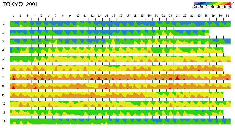
Temperature Variation during a Year
In exploration of meteorological data, variation during a year or longer period may reveal new aspects of the data. Figure 4 shows the temperature variation in Tokyo in the year 2001. Notice that the temperature every hour is visualized in a very small area. Data density of this image is about 830 per square inches. As a reference, the conventional coloring and the two-tone coloring are applied to figures 4(a) and 4(b), respectively.
Temperature variation on 2-D map
In both figures 4(a) and 4(b), global information is clearly shown. For example, hot weather persisted in July of this year, and the temperature exceeded 30°C almost every day. On March 31, it was very cold, and the temperature was almost the same as in mid winter.
In figure 4(b), viewers can also read out detail information. For example, the hottest day of the year was July 24 at about 2:00 pm, when the temperature reached about 38°C. In figure 4(a), on the other hand, it is very hard to read out such precise information.
(a) continuous pseudo coloring
(b) two-tone pseudo coloring
Temperature variation during a year Compressed display of temperature variation during a year
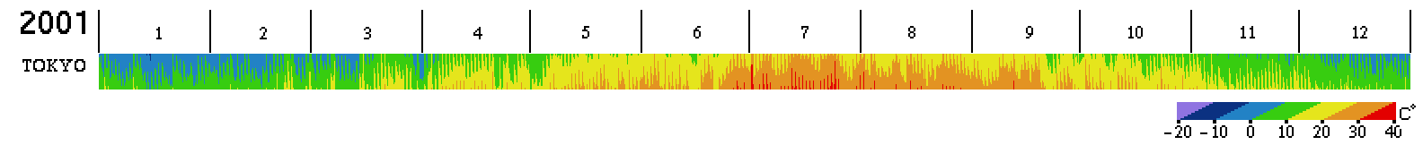
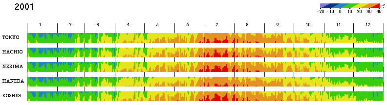
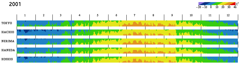
In order to compare multiple locations during a year, the visualized size must be smaller. Figure 5 shows an example where temperatures at every six hours are displayed so that the temperature change during each day is roughly shown. However, it is much harder to get information from this result than from Figure 4(b), because the color change includes too much high-frequency component in the image space. Figure 6 shows a comparison of temperature in the Tokyo area, where the maximum and minimum temperatures of each day are visualized. In this case, the highfrequency component is reduced and it is easy to get information. For example, all places have a similar tendency, but the minimum temperature in winter in TOKYO (downtown Tokyo) is about 3 to 5°C warmer than in suburban places such as HACHIO (Hachioji) and KOSHIG (Koshigaya). In summer, the maximum temperature is relatively lower at HANEDA, near the seaside in Tokyo.
Precipitation Variation
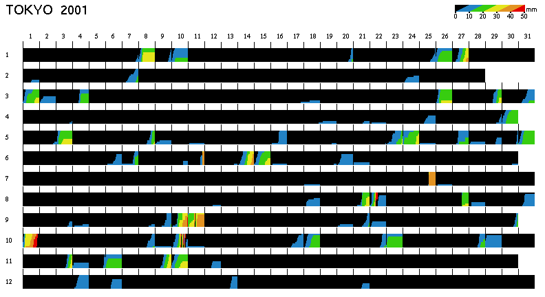
For visualizing precipitation data with two-tone coloring, it is not adequate to apply the same method as for temperature. Precipitation in one hour is usually about 1 to 10 mm depending on the strength of rain or snowfall. However, in the case of heavy rain, it sometimes becomes a very large value, reaching even 100 mm. Thus, linear scaling is not suitable for pseudo color mapping, so we use logarithmic scaling instead. Figure 7 shows an example, where each color corresponds to the value 4k mm.
There is another problem in Figure 7: colors indicate the strength of rain or snow, but the total precipitation cannot be obtained. To obtain such data, we propose to visualize the accumulated value instead of one-hour value. In Figure 8, the same precipitation data as in Figure 7 is visualized with accumulation. Colors indicate the total precipitation from the beginning of each day. Since the accumulated value becomes large, pseudo colors are used periodically, which is shown on Aug. 22, Sep. 11, and Oct. 10. The slope of the color boundary corresponds to the precipitation per hour. At the time of heavy rain, the slope is not visible, but the color alternation and repetition period show the precipitation per hour.
((a) maximum temperature
(b) minimum temperature
Maximum and minimum temperatures of each day around the Tokyo area Precipitation variation during a year Accumulated precipitation for each day
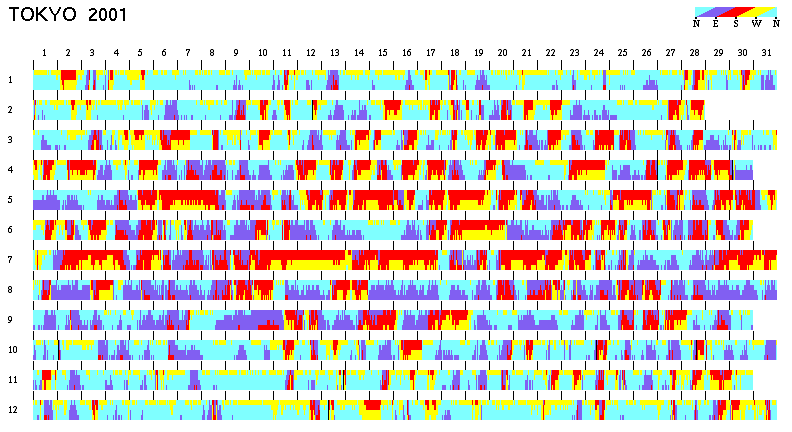
Wind direction variation during a year
Wind Variation
Wind is 2-D vector data, represented by wind speed and wind direction. Wind speed is scalar data and so two-tone coloring can simply be applied. Since the value can become very large in certain situations, logarithmic scaling is better than linear scaling. Wind direction is scalar but a kind of circular data, so it can be visualized as shown in Figure 9. In this example, the colors for four wind directions are selected so as to reflect the weather tendency in Japan (north: cold, south: hot, west: sunny, and east: rainy). Figure 9 shows both the features in each season and alternation in one day.
Convenience Analysis of Train Schedules
The convenience of a railway mostly depends on the train schedule. The minimum traveling time between major stations and train frequency are usually considered to be convenience factors. However, it is not easy to analyze the train schedule and to evaluate its real convenience if there are various kinds of trains, such as express trains and rapid trains, with different stopping patterns. Convenience depends on origin/destination station pairs, and might be extraordinarily inconvenient for certain pairs. It also depends on the timing; if a passenger comes to the origin station just after the departure of an express train, the journey might take much longer than the minimum traveling time.
Here, we measure the convenience with the following "actual traveling time". Let to be the passenger's arrival time at the origin station, and assume that the passenger takes the best train(s) to arrive at the destination station as early as possible. Let td be the arrival time at the destination. The actual traveling time f is a functionofto,and f(to)=td-to.Ifthisfunction f isvisualizedforall station pairs, then the convenience can be analyzed precisely.
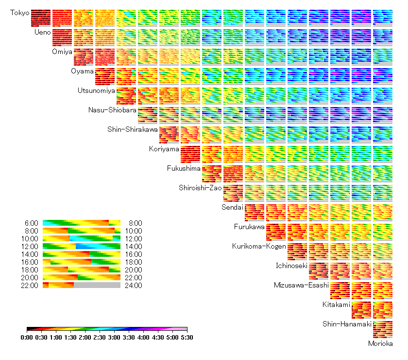
We have analyzed the convenience of several railways in Japan by visualizing the actual traveling time between each station pair. Figure 10 is an example for the Tohoku Shinkansen (a high-speed railway line between Tokyo and the north-east region in Japan). It is based on the train schedule for January 2000 [1], and only northbound is presented. For each station pair, the result is shown in nine pseudo-colored bars which correspond to two-hours intervals from morning to midnight (6am-8am, 8am-10am, 10am-12pm, 12pm2pm, ..., 10pm-12am). Data density of this image is about 8000 per square inches. Basically, the upper-left part of the chart has a long traveling time because the distance is long. However, the traveling time is relatively short for some station pairs such as (Tokyo, Sendai) and (Omiya, Morioka), because some express trains skip almost all stations except Omiya and Sendai. On the other hand, some station pairs have extraordinarily long traveling time compared with the distance. For example, (Nasu-shiobara, Shin-shirakawa) are adjacent to each other, but the traveling time may become 3 hours, because there are few trains that stop at both stations.
Intermediate Results of Numerical Computation
Techniques for visualizing the results of large-scale numerical com- putations, such as scientific simulation, have been widely studied. Actually, however, analysis of intermediate results is more impor- tant in some situations such as the debugging or tuning stage. Ex- ploration of intermediate results is also an effective way to obtain new aspects of the problem. Unfortunately, intermediate results generally become a huge dataset, and it is difficult to extract useful information.
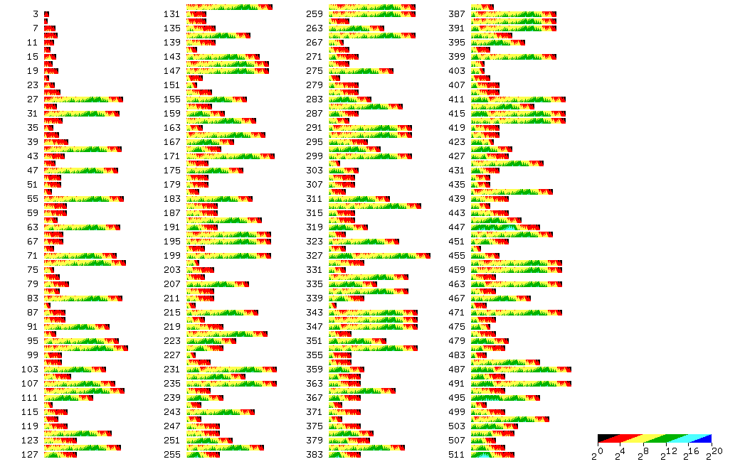
Here, we take the example of the "3x + 1 problem" [5], which is one of the unsolved problems in mathematics. The 3x + 1 prob- lem concerns the behavior of the following procedure for integer numbers:
The 3x + 1 conjecture asserts that, starting from any positive integer x, repeated iteration of this procedure eventually produces the value 1. Currently, neither proof nor counter example has been obtained yet. By starting with 7, for example, it becomes 1 after 16 steps:
.
If it starts with 27, it becomes large numbers up to 9232, and then comes down to 1 after 112 steps. With a simple program, one can easily confirm that various numbers become 1. However, great ef- fort is required to analyze all of their intermediate behavior.
Two-tone pseudo coloring is well suited to this problem. Fig- ure 11 shows the intermediate behavior starting from each of the 255 odd numbers (3, 5, 7, ..., 511). Logarithmic scaling is used for pseudo coloring. In this visualization result, several interesting features can be found. For example, most of the starting numbers with long steps have almost the same texture as the starting number 27, meaning that these numbers fall into the same behavior as 27.
Actual traveling time of Tohoku Shinkansen
Another feature shown in Figure 11 is that adjacent starting values often have almost the same number of steps: {145, 147} and {343, 345, 347} are examples.
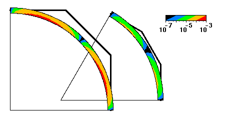
Value at Each Point on Curves
In scientific or information visualization, pseudo coloring can also be used for drawing 2-D or 3-D curves. Two-tone pseudo coloring is also effective in this situation if an attribute value is assigned to each point on the curve. Figure 12 shows a simple example, where cubic Bezier curves that approximate a circular arc are presented. Colors correspond to the position error from the exact circle.
This technique has potential for a wide range of applications such as speed or temperature on a particle trace, and traffic on road networks.
DISCUSSION
We have applied two-tone pseudo coloring to various kinds of data, and have found some tips for effective usage:
This method is effective for datasets with calm alternation, but not for severe alternation. It is important to select or modify the dataset so as to reduce the high-frequency component in the image space.
It is effective when pseudo-colored rectangles are regularly placed. For irregular placement in a 2-D map, however, it is hard to keep image space efficiency because of the occlusion problem.
Approximated circular arcs with Bezier curves
It is not necessary to match the value resolution and pixel resolution. Anti-aliasing of color boundary is effective if these two resolutions are different.
With two-tone pseudo coloring, image space efficiency be- comes very high, and in such situations it is often required to reduce the character space. Figure 2 is a good example.
This method is applicable to multivariate data, such as the simultaneous visualization of temperature, precipitation, and wind. However, it is difficult to choose good colors for com- prehensible result; if the same color is used for different units, viewers would be confused.
Intermediate behavior of 3x+1 problem
CONCLUSION
In this paper, two-tone pseudo coloring is proposed for the visualization of one-dimensional but very large datasets. By painting with two colors at each value in the pseudo coloring process, it is possible to visualize precise details within overview display without distortion. By using this method, the user can explore the dataset with less interactive image switching.
If the scale of the dataset becomes very large, however, details cannot be visualized with enough precision even by two-tone pseudo coloring. In such cases, the proposed method should be combined with a certain focus+context technique and effective user interaction. Also, multivariate visualization is one of the important extensions. These subjects will be addressed in future studies.
References
JTB Timetable, January2000. JTB (in Japanese),2000.
AMeDAS Annual Report 2001. Japan Meteorological Business Support Center (CD-ROM, in Japanese), 2002.
G. W. Furnas
Generalized fisheye views,
In ACM SIGCHI '86 Conf. on Human Factors in Computing Systems, pages 16-32, 1986.