Frédéric Vernier, Charles Perin, Student Member, IEEE
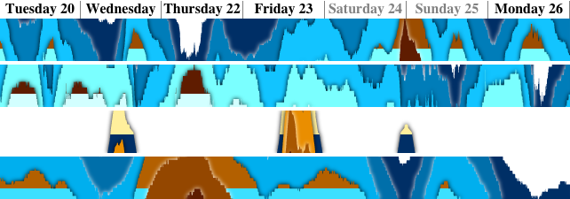
Same four time series (stocks) displayed with three previous visualizations and the new Stratum Graphs.
Horizon Graphs and Stratum Graphs define a threshold baseline and use a dual color scale around.
Two key areas of 24px high graphs are artificially zoomed in lenses to highlight user focus on up-and-down pattern.
Crossable sliders&buttons(right) control simultaneously parameters like zoom (x1, x5 or x9), visualization technique or black separators.
Abstract─Lorem ipsum dolor sit amet, consectetur adipiscing elit, sed do eiusmod tempor incididunt ut labore et dolore magna aliqua.
Ut enim ad minim veniam, quis nostrud exercitation ullamco laboris nisi ut aliquip ex ea commodo consequat.
Duis aute irure dolor in reprehenderit in voluptate velit esse cillum dolore eu fugiat nulla pariatur.
Excepteur sint occaecat cupidatat non proident, sunt in culpa qui officia deserunt mollit anim id est laborum.
Index Terms─Two-Tone Pseudo Coloring, Horizon Graph, Time series, Crossing interaction
──────── ♦ ────────
Motivations
New Design
In a previous work we conducted a user study with Horizon Graphs (HG) and realized how difficult it was to
explain to the subjects the horizon effect. Multiple superimposed bands are easier to explain but are sometime difficult
to see. In previous works Heer 09, Saito 05 authors use between 2 to 6
bands. Like Few 08, we noticed more bands (i.e. 6 to 8) are very difficult to untangle (distinguish) with
color scales used by our predecessors (i.e. 6 shades of red or blue in Figure 1XXX). In this work untangle refers
to the user ability to distinguish 2 adjacent bands, identify a specific band of color(i.e. the reddest one), and compare two polygons
far apart (do they belong to the same band or not).
In this past study we wanted to remain comparable with previous works and because we wanted to test another aspect of HG, we chose to avoid any extra
decoration. However we kept in mind the Infovis research community should sometime work on a better design to visually untangle the bands of the Horizon Graph.
This new work was first motivated by breaking visual conventions (24pixel height, color scales, low number of bands, etc.)
established by previous works in order to provide a new design with a sharper view on large number of bands.
Full Interaction
The second important thing we noticed in our early prototype was about interaction. We implemented interactive horizon and nunber of bands
as for Interactive Horizon Graph (IHG) Perin 13 and noticed users difficulties with combining zooms and translations.
These two actions impact a lot on shapes and makes difficult to keep track of bands and polygons inside bands.
Our second motivation was then to achieve a more stable interactive technique. During this effort we realized how interaction
with a set of graphs is important (i.e. changing the baseline for many graphs at the same time). Reducing vertical space
of graphs is especially useful when a large set of graph need to be drawn at the same time. To manage a large set of
stacked graphs we then implemented inspectors, navigation facilities and parameter panels to create a fully functional tool.
This work was motivated by learnability ans interaction usefulness, several previous studies focussed on usability and compared different settings.
Related works
Horizon Graphs(HG) Few 08Heer 09 are filled line graphs split by an artificial horizon and divided in
short-height bands which are then displayed on top of each other with 2 gradients of colors. The technique is more elaborated than Two-Tone Pseudo
Coloring(TTPC) Saito 05 where horizon is absent but has the same system of bands. HG only uses two color scales (usually red and blue)
where TTPC uses a rainbow color scale. TTPC is equivalent to HG with horizon set to the minimum value of the graph.
"Horizon Graph" name looks more popular than TTPC and is sometime used even without horizon like De Matteis13 and
Mondal 10.
Horizon provides a good way to split the values in two parts and reveal patterns. Heer 09 tested HG with 2, 3, and 4 bands and also
compared two ways to represent the values under the baseline (mirrored and offset). Perin 13 proposed an interactive horizon
and interactive number of bands to take advantage of horizon and zoom and let analysts achieve complicated tasks with it.
However setting up correctly the baseline is a challenge already raised by [Javed 10]:
"However, one caveat with horizon graphs is that they perform best with baselines that are individual to each time series so that the ranges for
the bands are utilized optimally (for example, the baseline could be the average of the vertical extents of the data, or the initial data value).
On the other hand, if the baselines are not identical across all time series, it is difficult to compare them in a meaningful way".
Small multiple strategy applied to time series has also been studied by Tufte with the sparklines[Tufte 06].
Unfortunately only the global tendancies and extrema can be easily observed with sparklines.
Colors used in previous works are mainly red and blue color scales (Few 08,Heer 09,Javed 10b,
Perin 13 and Reijner 08). Saito 05 also used raindow color scale for TTPC
and Mondal 10 added a green color scale to demonstrate up to 3 superimposed horizon graphs (but in fact they are TTPC) which
mix Braided Graph presented by Javed 10b and HG. Qualizon Graphs Federico 14 use a domain specific
color scheme which also imply non uniform band heights. StockMap3DStockMap3D 03 uses either rainbow color scales or a tailored
blue-black-red-yellow on a 3D organization of graphs. Finally only Bostock 12 uses more rational colors offered by ColorBrewer.
This section describes nine features to improve band untangling and provide full interaction with a large set of graphs. Some features are inspired from
other contexts (Crossing, min-max dots, Linearized color scales, Superimposed line graphs). Other features are very common in Infovis but they really
improve user experience with HG and TTPC (Halo, Picking&Linking, Smoothing, Numeric inputs) and were considered by previous works. At last we
present a new technique called Stratum Graph(SG) as a more stable alternative to HG. We first present Haloing and linear color scales because they will
produce much better illustrations in the next sub-sections. We present then the Stratum Graphs(SG) as it is the main contribution of this work. Finally
we describe the Superimposed line graph and all features related to interaction (Picking & Linking, Crossing interaction, Sorting facilities,
Smoothing and Numerical Inputs).
After sections on halos and color scales, features are described and illustrated with Stratum Graphs(SG) unless another technique presented in previous works (Saito 05,
Heer 09 and Perin 13) is mentioned :
Mirrored Horizon Graph (MHG)
Offset Horizon Graph (OHG)
Reduced Line Graph (RLG)
Two-tone Pseudo Coloring (TTPC)
TTPC, MHG are illustrated in Figure 1XXX. OHG is very similar to MHG and RLG is a TTPC with only one band. We also
considered a variation of TTPC and SG where the two-tone coloring starts at 0 instead of the minimum value of the graph.
During the implementation we often tested the seven visualizations with the features presented above. We had to design carefuly each one so they
all co-exist together and work on every visualization.
Halos
Halos around every polygons is the first idea to improve readability of the horizon graph. Halos investigated by Luboschik08
can emphasize items in Information visualization. We applied halos to TTPC and HG and Figure 4XXX
shows the same graph split in 5 or 3+3 bands with and without halos. Contrast improves readability of the graphs but do not look not mandatory for readability.
However when color scale is broader like Figure 3XXXa with 5 shades of blue, halos either black (Figure 3XXXb)
or white (Figure 4XXXc) make a difference to distinguish/untangle the polygons. White halos better work on darker colors when
black halos better work on brighter colors. If the color scale use both bright and dark colors then both kind of halo can be used in the same graph.
The mixed halos like
illustrated in Figure 4XXXd. Both kind of halos are illustrated in the 4 lowest graphs of Figure 1XXX
where darkest bands have white halos and brightest bands have black halos.
a:
b:
c:
d:
TTPC with 5 bands(a, b) and HG with 3+3 bands(c, d) without halos (a and c) and with black halos (b and d)
a:
b:
c:
d:
Single hue TTPC or HG with 0+6 bands. no halo(a), black halo(b), white halo(c) and mixed halo(d)
Colors & Texturing
An other possiblility to untangle bands is to apply different schemes of stripes or textures associated with each band (Figure 5XXX).
However the results are very subtle compared to halos. It sometimes helps to distinguish polygons with very similar colors like the reddish polygons
F and G labelled in the Figure 3XXX. The similarity of colors comes from non linear human perception of colors (here it looks
easier to distinguish light reds than deep reds).
a:
b:
c:
d:
HG with stripes(a, b) and numeric textures(c, d) without halos (a and c) and with halos(b and d)
Finally other colors scales than the traditional dual-ended blue/red can be tested.
We were advised to test linearized colors scales as used in [Levkowitz 92]. Effectively the heated scale for positive bands and
a blue-to-cyan scale for the negative bands(Figure 5XXXb) is better contrasted than original blue/red(Figure 5XXXa)
for 5+5 bands.
Such color scales produce better distinguishable colors everywhere in the scale because they are larger in luminosity (from black to white) and because
the intermediate steps were chosen to match human perception, not numbers in RGB chanels. Figure 5XXXd and Figure 6XXXa
show 9 shades of the same color scale remain distinguishable. In this case of large number of colors halos become very useful like illutrated in
in Figure 6XXXb for 9 colors. For even larger number of colors like the 19 shades in the blue to cyan color scale
Figure 6XXXc HG or TTPC become similar to color coded graphs of Line Graph Explorer[Kincaid 06]
which can produce very thin graph representations [Lam07]. Figure 6XXXd show how halos break this effect
but bring back some features of the graph like the shapes of the extrema.
Heated and linear blue scales offers an geographic metaphor if darker blues are assigned to lower values.
Values around the baseline can be compared to colors around sea level. Deepper sea levels are darker and grounds near sea are covered by yellow sand.
the metaphor produced by these color scales is secondary for perception but can definitively helps to learn the technique.
a:
b:
c:
d:
Original HG (5+5 bands)(a), Linearized colors (b) and with halos (c). Heated scale applied to 9 bands remain readable (d)
a:
b:
c:
d:
Blue To Cyan scale applied to 9 bands (a, b) and to 19 bands (c,d) without halo (a, c) and with mixed halos (b, d)
Stable baseline: The Stratum Graph(SG)
The horizon effect of the baseline is akward to understand and to explain to others.
However multiple bands effect is easier to understand and makes the real power of the technique (saving screen space).
Stratum Graph(SG) is a refinement of HG/TTPC with no cut at the horizon like TTPC.
Like HG it still displays a baseline but with a shallower(less disturbing) effect than HG we call stratum.
SG displays the same shapes than TTPC but uses a three-tone pseudo coloring in the band including the baseline value. For all the other bands
it uses a two-tone pseudo coloring with two different color scales for the values under and above the baseline.
For the particular band containing the baseline, SG mixes the two color scales.
Figure XXX7 illustrates the scales used by SG for 5, 9 and 13 bands :
a:
b:
c:
d:
The Two/Three-Tone Pseudo coloring used by Stratum Graphs for 5, 9, 13 and 19 bands. Baselines set in the exact middles.
a:
b:
c:
d:
e:
Stratum graph with baseline at top(a), between 3rd and 4th band(b)
, middle of 2 bands(c and d) and bottom (e)
Figure XXX7 illustrates from top to bottom different positions of the baseline on the same graph :
top (all bands are gradient of blue): Figure XXX7a
exactly between 2 bands (no band being of 2 colors): Figure XXX7b
anywhere (one band being of 2 colors): Figure XXX7c and d
bottom (all bands are gradient of heated/brown): Figure XXX7e
The logical position of the baseline do not change the shape of the Stratum Graph, it is relatively stable for user's eyes
(Figure XXX6a to Figure XXX6e all look the same) unlike IHG([Perin 13]).
Band's colors are also very consistent when baseline change. A given band with a stable shape can have up to two colors because the color do not
depends on baseline position. It breaks up a little bit the metaphor since the darkness of water is related to the sea level but stability was a
major concern to learn the HG and the sea metaphor is only a bonus feature.
Red rectangle in Figure XXX7c and Figure XXX7a contain 3 colors (dark blue on top, brown in middle,
brighter blue at bottom) and illustrate the "three-tones" pseudo coloring for values near the baseline.
Beside the new design, the baseline can be used like for IHG described in[Perin 13] and can be efficiently positionned
where spatially separated values need to be compared. Figure 8XXX circle two comparable areas with three local maxima.
Those maxima can be very easily spotted by searching brown polygons not touching neither top or bottom. The brown areas found can then be easily
compared (the first two are closer to each other, the second maximum is the highest, the 3rd maximum is the largest and the least regular, etc.).
Another interesting property of SG is the contrast around the baseline. When HG always creates a poor contrast due to desaturated colors used
near the baseline, SG suffers the same problem only if the two color scales chosen have the same luminosities for the same values. However SG
do not need to keep the symmetry around the baseline and use a reversed color sclae for negative values. The constast near the baseline is then
always very strong but near the average values(middle of the color scales). Fortunately, near the average values the contrast of luminosity is poor
but it is where the contrast of hue is the highest (far from black and white). In this case the halos presented in the previous section also work the
best because in the high and low value are bot represented by dark colors (either dark blue or dark heated) and then have white halos. Only the few
bands near the average values have dark halos and then guide user attention to them.
Figure 8XXX show average colors contrast in the first and fourth graph, dark on bright contrast in the second graph and bright on dark constrast in the third graph.
SG contrast can be compared with HG contrast in the magnifing lenses of Figure 1XXX at the end of 2007 where the time series
labelled GOOG cross slighly the baseline.
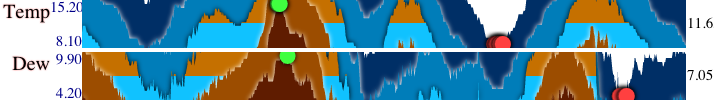
Four SG on Temperature/Humidity/Rain/Pressure during a week of November 2012.
All baselines chosen to compare maxima far apart.
A very interesting aspect is the user action (motor space) on the baseline occurs in the magnified space like in with fisheyes of [Appert].
It means if the frontier between blue and brown(baseline) is grabbed and moved, it will be done very precisely and spatial coherence with grabbed
area is preserved (unlike IHG). This drag&drop can be extented outside the graph where the baseline can still be manipulated in magnified motor space.
However the spatial coherence of the mouse cursor and the baseline is lost (with a new constant offset every time the baseline moves to a new band).
Stratum Graph can initiate Baseline dragging at any point of the graph, not only where the frontier is visible. In this case there is a contant offset
at startup. Even with stable shapes and colors (simpler than horizon manipulation) these offsets are designed for expert users and then the system
requires a modifier key to be pressed during drag&drop.
Regular drag&drop is used for another feature we'll describe later : graph re-ordering. In addition to this relative manipulation of the baseline the
observations of long and tedious dragging tasks suggest the implementation of an absolute baseline tool. Mouse "double click" on a graph triggers a baseline
repositioning at the exact position of the double click.
Once again the new baseline repositioning is performed in the magnified space (high precision) and spatial coherence is better preserved: after double click the
baseline always appears just below mouse cursor. Such behavior couldn't be obtained with IHG because setting the baseline move the horizon to the bottom or top
of the graph.
Stratum graph achieves all our goals (stability, contrast, precision) and also provide a more coherent way to manipulate the baseline.
Stratum Graph maps the number of bands (zoom) to mouse wheel actions like for IHG but with a modifier key to avoid unwanted interaction.
Again this feature is designed for expert users.
Superimposed Reduced Line Graph and Extrema
Previous studies revealed how difficult it is to untangle more than 4 bands and to form a mental representation of the graph.
Designer should't rely on the HG/TTPC to convey all the necessary information provided by a global view (landmarks, extrema, outliers, etc.).
The new design provides an overlay with red dots to highlight minima and green dots to highlight maxima like for sparklines [Tufte 06]
(Figure 9XXX), a superimposed RLG on demands similar to Mondal 10
(Figure XXX10) and numerical values at both ends of the graphs.
As shown in Figure 1XXX and Figure 11XXX
the numerical values of the minima and maxima are also displayed on the left of each graph and the value of the baseline is displayed on the right.
These numbers can be clicked to highlight the corresponding values in the graph with the later described inspector.
If a graph contains or cross several times the chosen value, clicks cycle through the different positions. For instance clicking on "8.10" or "4.20"
in Figure 9XXX move the inspector over the multiple red dots of the graphs.
The superimposed RLG illustrated in Figure XXX10 is improved with a horizontal line where the baseline is to help catching
up this important feature of HG and SG (b, c and d). For OHG, TTPC and SG the maximas and minimas happen at the same location for RLG and the underlying graph.
For MHG minimas are upside down.
The superimposed RLG may look nice at first glance but revealed to be very disturbing in real usage.
As consequence this feature can be activated on demands (especially for users with very little litteracy with Horizon Graphs) but is not activated by defaut.
Two Stratum Graphs with red dots on minima and green dots on maxima.
a:
b:
c:
d:
Superimposed RLG on TTPC(a), OHG (b), MHG (c) and SG(d)
Picking & Linking
During our previous study on HG, our colleagues raised an interesting remark about one of the tasks used for the study. The task "Finding the maximum" was
found very artificial by many since an automatic tool could easily detect and highlight the maximum in a graph. The task was kept because it was a good
representative for all the "finding" tasks. Maximum or minimum were used as non ambiguous targets to ask user to find and compare. Comparing values however
is tedious and can be greatly improved with picking.
The picking tool circled in Figure XXX11 is a very standard tool in infovis. When the mouse hover a graph, the numerical value is displayed.
This tool is unfortunately not good enough to make obvious the comparing task of the previous studies. The system provides a Picking&Linking (P&L) tool similar
to Brushing&Linking(B&L) [Buja 91]. P&L result is framed in Figure XXX11 and allows to select one
timestamp in a given graph and the system displays all values at this time in all the other graphs. The result is a set of aligned numbers where number of digits
can be used to spot outliers (i.e. in Figure XXX11 the GOOGL row displays one more digit than the other rows). It is similar to
"Simultaneous Data Point Highlights" described in DeMatteis 13 and also implemented in Bostock 12.
Unlike (B&L) the (P&L) allows to select only one value when B&L also provides a brushing component to select many elements rapidely (i.e. rectangular
selection, circular large brush, etc.). The strength of P&L consists of displaying an in-situ numerical values in all graphs aligned like in a spreadsheet.
The system also provides a way to relate objects of interest along the x axis.
The polygon where the picked value is displayed is also highlighted. All other polygons of the same graph at the same level (in the same band) are
simultaneously highlighted using a slightly less vivid color.
This feature not only helps untangle the selected band from its neighbors but also makes the absolute baseline repositioning more predictable.
Double click moves the baseline at mouse position and impact exaclty the previoulsly highlighted polygons.
Picking&Linking with numeric values in framed column (left)
Mouse hovering value circled (middle).
Arrow on crossing interaction to set first 8 baselines simultaneously (right)
Range slider to set initial and final values (top)
Crossing interaction
Crossing interaction takes advantage to element proximity and alignement to enable fast interaction with a large set of elements. A good example
of crossing interaction is multiple checkboxes selection with one single dra&drop gesture.
Horizon ans Stratum graphs reduce graph heights so they can display a large set of elements close to each other.
Adjacent and temporally aligned graphs make a perfect candidate for crossing interaction.
To enable meaningful crossing, evenly distributed sliders are displayed on the right of every graph to control baseline, zoom level
(and also smoothing level described in a following section).
Baseline sliders simultaneously control baseline positions. For example by clicking and dragging along the red arrow in
Figure XXX one can set the baselines of the three last graphs at the same time.
Unfortunately the semantic of simultaneous baseline control is many-sided. The system proposes then four behaviors controlled by 4 radio buttons on top of
the baseline column.
The first two radio buttons let the user manipulate the sliders between minimum value and maximum value of each graph or betwen the global minimum and global maximum of all graphs.
The last two radio buttons let the user manipulate the sliders proportionally to the initial or final values of each graph (between 0% to 500%).
Thess powerful interactions scale up to hundred of controls exactly the same way as Bertifier matrix rows [Perin 14].
The result multiplies the interactive power of IHG [Perin 14] but needs a very fast drawing algorithm so each movement of
the pointer trigger updates on all the graphs continuously like dynamic queries Shneriderman94.
Fortunately SG, unlike HG, do not need to go through polygon making process and only textures of the polygons need to be updated.
Similarly to sliders, crossable radio buttons allow to simultaneously control which kind of technique is used (TTPC, MHG, OHG, SG) for the chosen set of graphs.
Other radio buttons enable/disable black separators like between the 3 groups of 4 visualizations in Figure XXX or allow to choose color scales
among 12 possibilities. Other columns of radio buttons reverse the color scale or activate/deactivate decorations (halo, superimposed RLG,
time ticks along the horizontal axis and minima/maxima red dots).
All these controls take a lot of horizontal space so we grouped them by categories in collapsable columns on the right of the graphs named Baseline, Zoom, Smooth, Sort,
Visu, Colors and Deco.
Manual reordering & sorting facilities
Crossing interaction becomes very useful when many elements (requiring a common operation) are side by side and aligned.
Two features improve this situation when the initial set of graph do not naturally fit user's needs.
First, drag&drop interaction enable to move a graph anywhere among the other graphs. However such interaction is ill
suited for large number of graphs. It is also not very suited when the task is to re-order the set of graphs according to some criteria.
The second feature provided by the system is a sorting tool similar to mako 12 with the additional flexibility
provided by crossing interaction.
Pretty much like the bertifier [Perin 14] the system proposes an animated sorting tools on crossed buttons like illustrated in xxxtools-left.
When a set of adjacent sorting buttons are crossed, only the chosen sub set is re-ordered unlike mako 12 where
all the graphs are always re-sorted. However like this system many sorting schemes can be pertinent according to the dataset (alphabetical order of graph's
names, initial value, final value, relative progression between initial and final values, amplitude between min and max, external value attached to each
graph, etc.).
Unlike [Perin 14]the system must provide then multiple buttons to refine sorting. [Kincaid 06] use multiple
criteria to sort time series. For example a set of 100 stocks can be first sorted by
category, the chosen category can then be re-sorted by company's size and finally the top 5 can be sorted again according to the financial gain during
a given period. The last sort needs a time interval selection and like mako 12 the system uses a range slider illustrated at top of
xxx. This slider is similar to Shneriderman94 with the same goal: refining the focus of interest in
several steps. Unlike mako 12 the range slider is displayed on top of the graphs, temporally aligned with them. The range slider
is also used for defining the inital and final value used by the baseline tool described in the previous section.
Smoothing
a:
b:
c:
Noisy time series with RLG(a), SG(b) and SG with halo(c) without smoothing(left) and with Smoothing(right)
Data smoothing looks probably the least important feature in the list of implemented features, howver it is not the least important one.
Horizon and Stratum graphs stretch space vertically without stretching it horizontally. It increases precision in the value domain, reduces height and
build an hybrid technique between line graphs and heatmaps like [Lam 07]. With a very high number of bands HG become heatmap graphs.
The zoom factor may stretch too much the data for human eyes and display erratic high frequency variations. We also found these high
frequency variations in real life datasets (like wind speed gust or some stocks).
Horizon and Stratum graphs stretching make things even worst. For these reasons final user needs an opposite force like self-organizing maps used by
[John 08] for multidimentional data. Fortunately time series can often be smoothed on the time axis because time is a continuous
and smooth dimension.
The system provide a feature to smooth the data of eevery time serie then smoothing the graph. It uses a standard gaussian kernel filter
where the radius of the kernel remains controlled by the end user through another crossable slider in the right column.
The result of smoothing an erratic time serie is illustrated in Figure XXX. These data represent wind speed gust recorded
by a meteorgogic sensor.
Smoothing the data modify the data and can be considered a lie in some way. Crossing interaction on multiple sliders ensures the same kernel is
applied to several time series and the results remain comparable. Smoothing can be used to detect trends and patterns but definitively disable
the possibility to detect maxima and minima. Infovis is more concerned by the first point.
Numeric inputs
In addition to crossable sliders the system provides numeric inputs illustrated in xxxtools-right to set height, interspace, zoom and baseline
Zoom level and baseline of the selected graph (or set of graphs through a filter mechanism) can be expresed
as a percentage of the initial value set by the range slider
as a percentage of the final value set by the range slider
as an absolute value
as a percentage between Maximum and Minimum (for baseline) or given number of bands (for zoom)
These tools do not easily apply on adjacent set of graphs but apply on graphs with a given substring in their title or description.
The numeric inputs are useful to setup the initial view of the system accordingly to the dataset and user's task before exploration starts.
When exploration led to uncertain discoveries, numeric tools can also answer specific questions like "which graph double its inital value the fastest ?"
or "How many graphs never reached before their final value ?". Stephen Few describes such tasks in his analysis Few 08 of Horizon Graphs.
The numeric inputs are then very complementary to crossable widgets.
Crossed buttons sort 3 groups of graphs with different criteria (left)
Numeric inputs set common parameters to filtered graphs (right) .
Implementation
This work introduces SG and also presents visual enhancements applicable on SG, HG and TTPC to make bands easier to see and untangle.
This goal requires a fast algorithm to construct polygon based version of the graphs (vector graphics).
An inefficient algorithm can display several times the graph at highest resolution with different offsets but always the same
clipping area. This approach mutiply the displays by the number of bands. It is slow for a large set of graph,
a large number of bands or CPU consuming features like halos.
Saito 05 describes a pixel based algorithm. The algorithm is easy to implement and efficient for dense data.
Visual enhancements like halos require to modify background colors on the left and on the right of foreground shapes. Otherwise
halo will not be regular and almost invisible on steep curves, where generally multiple bands overlap each other. An
isotropic halo do not seams to be possible with a pixel based algorithm.
In the case of SG the pixel based algorithm requires to be run completely every time the baseline is moved.
The efficient vector graphic algorithm is not trivial so we describe it here to help reproduce this work.
Like Saito 05 the new algorithm is a scanline one.
It builds logical shapes (polygons) in a stack data structure instead of filling an image row by row.
The algorithm manages an ongoing polygon (the polygon on top of the stack) and processes values from the time series
in temporal order. Timestamps and values are transformed into x and y in a linear way and y
are translated in the visible area of the graph with a modulo operation, the euclidean division gives
the band altitude(level) and remains attached to the polygon.
Every new value processed by the algorithm which increase enough to cross one (or more) band(s) creates
a new polygon and the ongoing polygon is stacked under it for later processing.
For every new value, which decrease enough to cross one (or more) band(s), the ongoing polygon is finished/closed
and removed from the top of the stack. The new polygon on top of the stack becomes the ongoing one.
In both cases (increase and decrease) an interpolated timestamp is computed at the limit of the two bands and
is used in both polygons involved (before and after stacking/unstacking)
In all other cases (feeding values remain in the same band), only the ongoing polygon is updated.
Left + Central + right area of a polygon
At startup the algorithm creates in the stack a set of polygons correspoding to the levels between the
bottom (or baseline in the case of HG) and the starting value. At the end of the algorithm the remaining polygons in the stack are closed with
additional top-right and bottom-right points.
The algorithm must also handle the complicated case where two consecutive values cross several bands.
In this case the algorithm computes several interpolated timestamps and stack/unstack several polygons.
All the polygons are created and stacked with a band altitude(level) attached to them. When data parsing is done, all the closed polygons
are sorted according to their level so the highest polygons will be displayed on top of lower ones.
Finally a color or a texture is created for every level and sorted polygons can be displayed
with the possible visual enhancements provided by the graphical toolkit (textures, color gradients, halos, etc.).
The constructed polygons can also be used to find polygon under the mouse and highlight it.
The general shape of one polygon has a left crafted area crossing the whole height of the graph, a central
flat area and a right crafted area crossing the graph height in the opposite direction ( Figure 2XXX).
The central area will be partially overlaid with polygons of the higher levels with their halos. Some polygons with local maxima do not have a central
flat area. Some polygons with local minima are more complex than the general shape and alternate flat and crafted areas like polygon labelled "B"
illustrated in the example above.
Labelled polygons created during the process
The Figure 3XXX shows a labelled example where polygons A and B are created in the stack at startup. Polygon A is closed very
soon while B includes two local minima and is stacked and unstacked many times during the process and is finally closed the last. When polygon G is
created and closed (it's never stacked as a local maximum) many polygons are in the stack under: B, C, E and F. Polygons A and D are already closed at that time.
Polygons of the same level like A, C, and H are created among polygons of other levels, that's why polygons must be sorted at the end of the algorithm.
We implemented this algorithm with the javascript language and HTML5 canvas as graphical toolkit (one per graph). We also used jquery and jqueryUI to
integrate the graph in the web page, connect them to each together and handle the user interaction.
Contributions & conclusion
We developed a novel compact but stable graph visualization based on the Horizon Graph(HG) and Two-Tone Pseudo Coloring(TTPC) called Stratum Graph.
Stratum Graph makes it easier to understand baseline, especially when it is interactively modified.
We also applied features inspired from other contexts (Crossable buttons and sliders, min-max red dots, Linearized color scales, Superimposed reduced line graphs) or
basic features which really empower the horizon graph framework (Halo, Picking&Linking, Smoothing, Numeric inputs).
The visual features cannot be evaluated one by one because they (sometime) impact each others. However we hope the screenshots provided in this paper
will convince the reader there is a large and growing family of compact graph behind popular "Horizon Graphs" and many visual properties to take into account.
The second main contribution of this paper was to provide a much larger set of interactions than interactive baselines and zooms [Perin 13]
We implemented interactions inspired from several online prototypes or described in research papers and the online prototype proves they work well all
together with Stratum Graphs and someties with HG or TTPC.
The most innovative contribution is the crossable sliders and buttons inspired from Bertifier[Perin 14] applied here to a very different
context: compact graphs. The proposed interactions unlocks fast access to large number of graphs.
Finally we described an efficient vector graphics algorithm to build and refresh in real time a large set of graphs.
We carefully chose initial values of the parameters and provided a way to change them on demand. Our tests with three differents datasets (unemployement
in 50 US states, Stock market of 100 values in SP100 index and meteorological data) showed usefulness of every feature really depend on the dataset itself.
The best candidate application domain seams to be stock market visualization where the need for fine-grained and coarse-grained granularity (from
minutes to years, comparing 2 stocks or an indice of 100 stocks) do not need to be proven. For this domain every interaction proposed here corresponds
to trader's tasks.
Many potential users work every day on very large financial datasets and displaying a baseline (either with horizon or stratum line)
perfectly fit their multiple usage of thresholds.
With the most prominent features presented in this paper
(linearized colors, halo, Stratum graph, sorting by crossing) we can here expose a static view with a quarter million values.
Figure 2XXX illustrates 100 stocks (Standard&Poors 100) priced at the end of 2500 days (>10years)
fits into a regular 30" screen resolution (2550*1600).
The most important challenges this work did not attempt to tackle are multiple time resolutions (i.e minutes+years) and discrete event/annotation linkage
(where and how to display textual information related to one or more time series at a given time). The most critical domain-dependant feature is to enlarge
the set of sorting algorithms. Multiple sorting is a very powerful feature but its benefit depends on underlying sorting functions. This feature makes possible
to rearrange all the graphs in very few mouse gestures. It suddendly makes visible new global patterns while a closer look reveal new interesting
graph similarities. One interesting axis to develop would use the position of the Brushing&Linking as a pivot value for sorting but any external
information on time series or any math formula on graphs can create new uses.
Crossable widgets allow to rapidly tweak the spotted graphs, transform TTPC into HG then into SG. Tweaking the baselines is the most powerful feature among
crossable widgets. It enables to reveal patterns, compare, confirm or refute user's findings.
The new Stratum Graph visualization raises interesting questions. We only investigated straight and unique baseline while the
technique can clearly be applied to multiple meaningful baselines like Qualizon GraphsFederico 14 or even non horizontal
baselines (i.e. a diagonal line from initial fo final value showing the average slope). At last the stability of Stratum graph should permit a nice
animation between a compact representation into an unfolded line graph. This animation could be used in a Focus+Context interaction where the chosen
graph(s) could be enlarged like in Table Lensrao04.
Tufte, E. R,
Beautiful Evidence. Graphics Press, 2006. (ISBN: 0961392177).
Forum on sparklines
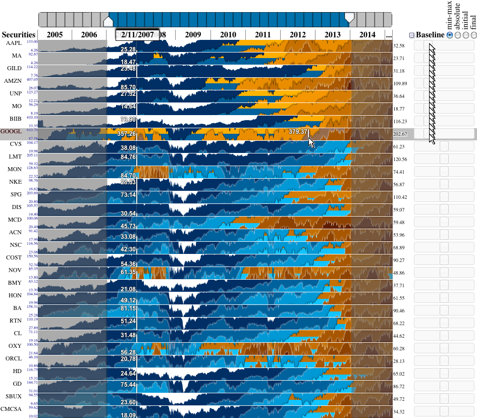
The tool with 100 stocks values sorted by performances, min and max highligned with red dots.
Baseline is set to the initial value and one band represent 50% of this value (2 positive bands means the stock doubled its value).
The enlarged stock "F" is the Ford Motor company. Mouse is positionned over the maximum in mid-2014 is diplayed numerically.
Each graph is 13 pixel high and 2 more pixels separate each graph (can be blackened to visually separate graphs)